Information visualisation refers to techniques and systems that create largely visual (but also sometimes aural or tactile) representations of information structures. A simple example is the use of a histogram or pie chart to replace or offer an alternative to a table of numbers.
Used in Chap. 7: page 89; Chap. 21: page 337
Also known as: visualising data
Links:
 alandix.com: A short introdcution to Information Visualization
- hcibook.com: Videos: Information Visualisation
- meandeviation.com: Interactive stacked histograms (dancing histograms)
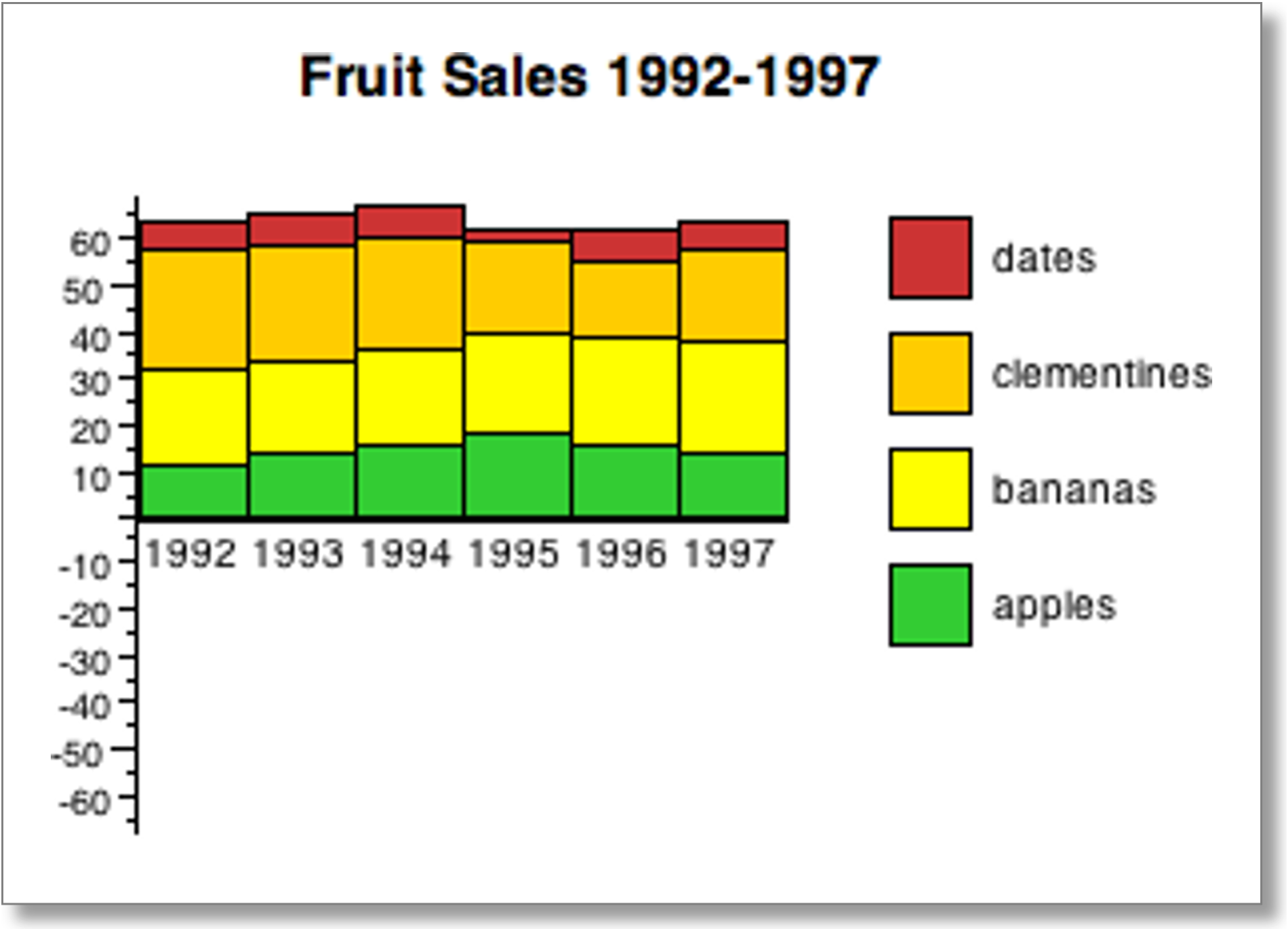
A plain stacked histogram – easy to discern overall trends and trends in the baseline category (apples), but other categories less clear
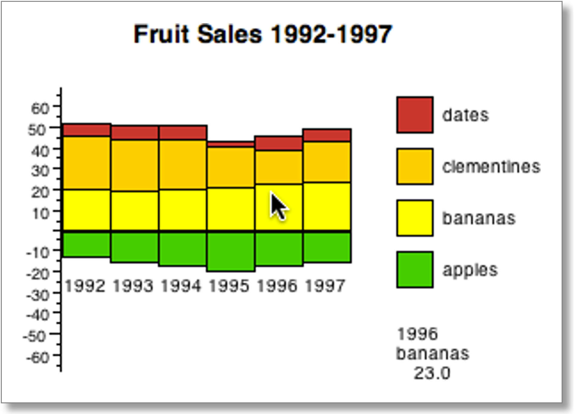
Dancing histograms add interaction – click on a category (bananas) to alter the baseline and make trends in that category easier to see.
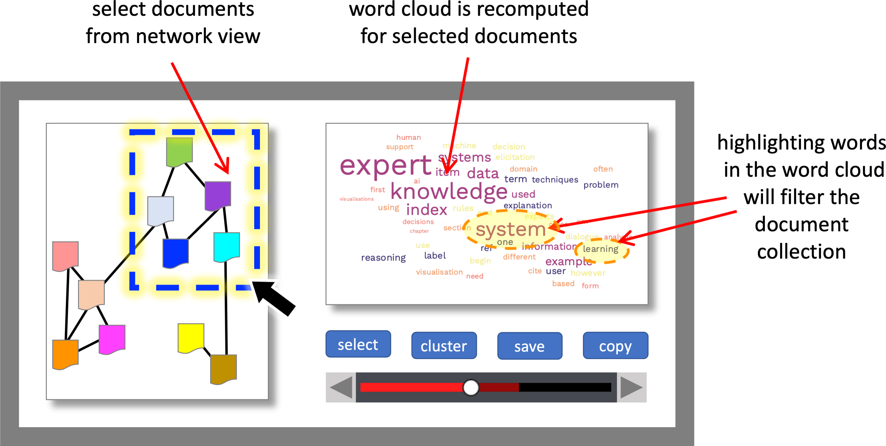
Connected visualisations.